
SurgiTutor

Problem:
In the current lab setup, healthcare students assess their knowledge of surgical instruments by labeling physical tools arranged on a table. Each tool is tagged with a number, and students write the corresponding names on paper to submit to the instructor for manual grading.
Because there is only one set of instruments available, students must complete the quiz in small groups, often leading to time constraints and incomplete participation within the scheduled class period. Additionally, this in-person format limits opportunities for students to review or study the tools outside of lab sessions.
Solution:
The SurgiTutor app was developed to provide students with flexible, self-paced learning and assessment opportunities. The app allows learners to explore 3D models of surgical instruments and complete quizzes digitally, reducing the need for physical setup and manual grading. Designed for both mobile and tablet devices, it offers convenient access for use during class or individual study.

Wireframes were created for both mobile and tablet versions of the application. This ensures that students are able to complete learning and testing using their personal mobile devices or alternatively use the tablets provided in the lab.
Role: UI design
Skills: Wireframing, prototyping, user interface design
Target audience: Medical students, residents
Software: Adobe XD, Adobe Illustrator
Format: Mobile and tablet web app
Copyrights: © UNMC iEXCEL
Wireframes
Several iterations of wireframes were developed to refine the interface and interaction flow based on usability testing feedback. The design prioritized the ability to view surgical tools in 3D within both the learning and quiz modes, enhancing users’ understanding of each tool’s form and characteristics.
First iteration
The initial design featured a different menu structure, which separated tool categories and specialty tools into separate menus. Thq quiz format is a dropdown selection for each question.
Later iteration
The menu system was simplified into a cleaner and more unified system. Additionally, the quiz format was revised from a dropdown selection to multiple-choice questions to streamline navigation and reduce the number of interactions required to complete the quiz.


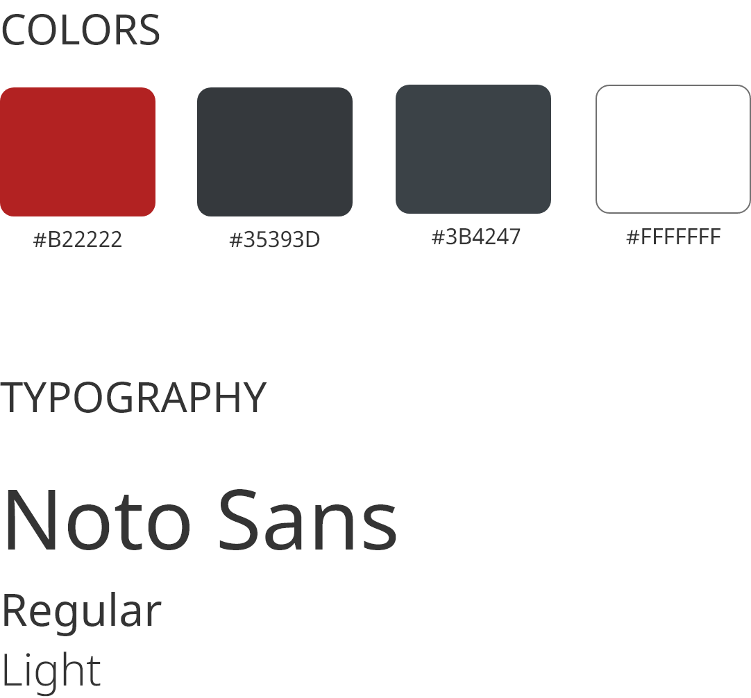
Colors and fonts
The visual style of the app was designed to be simple, clean, and functional, supporting its purpose as a didactic teaching tool. The color palette follows the university’s branding guidelines, with red being used as an accent color to draw attention to key elements. Dark background colors were selected to enhance readability and reduce visual strain.
Noto Sans was chosen as the primary typeface for its clarity and modern feel, allowing the educational content and 3D assets to remain the focus of the interface.
Results
Here are examples of clips from the final product. The final implemented version of the app shown in the clips slightly differs from my original design specifications due to development constraints. The visuals and layouts presented in this case study represent my intended design direction.